Music is played, not worked
Treble starts with music making, together. By forgoing the old-school lesson model, Treble keeps learning accessible for students and avoids overloading teachers with scheduling, recruitment and administrative work.
“Coming Soon”
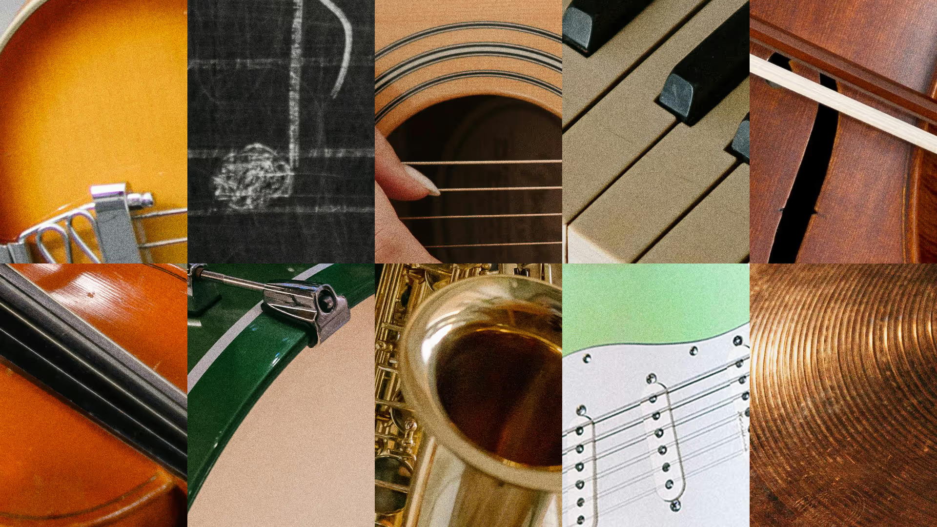
Emphasizing in-person interaction means di erentiating Treble’s brand voice from the crowd of online learning platforms. The new identity needed to be loud and clear, filtering out the noise to establish a welcoming place to teach and learn. Visual references and research began with finding a combination of type, colour, composition, and imagery that felt familiar without getting nostalgic. I looked to letterset type and vintage poster designs that evoke anticipation of an upcoming event.
BRAND DESIGN, VISUAL IDENTITY, COPYWRITING, DIGITAL & PRINT, PHOTO EDITING, VISUALIZATIONS
Read More
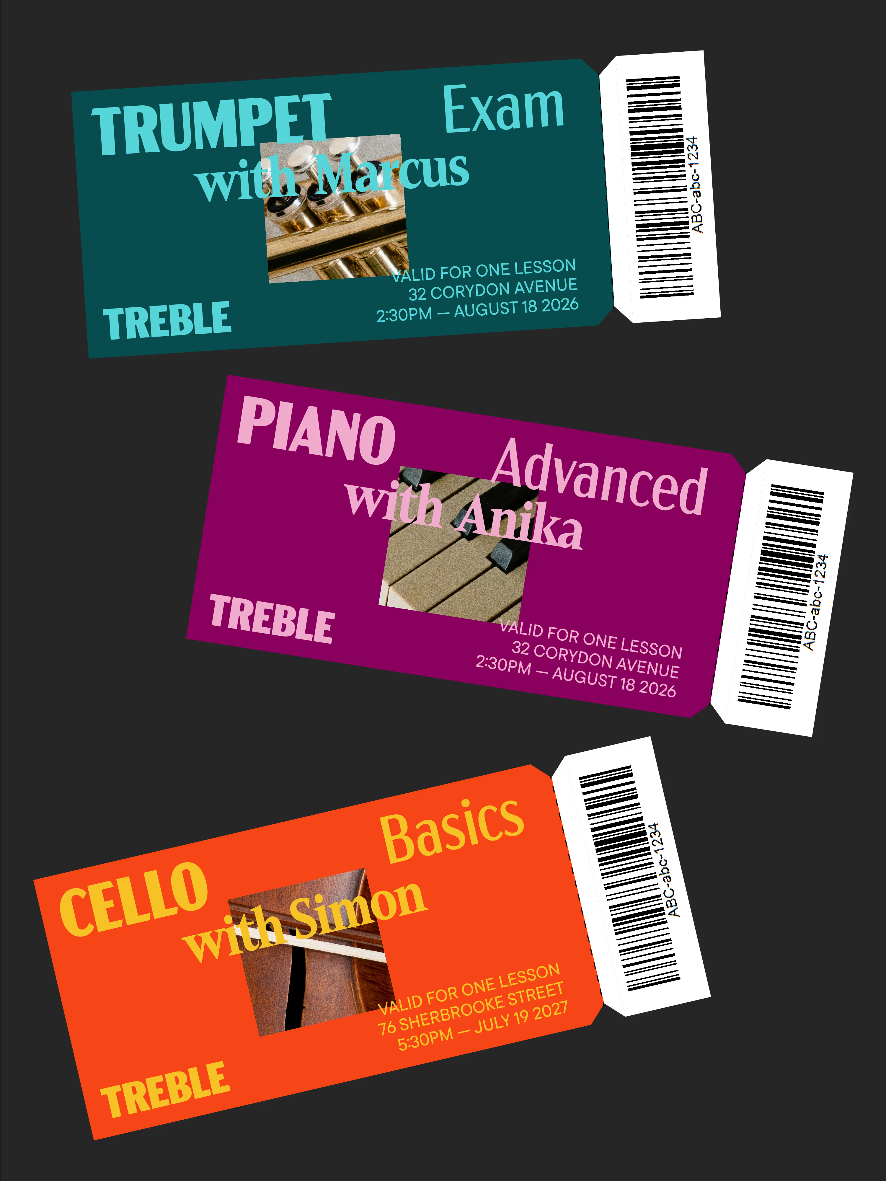
A visual identity with range
I created a design language built upon the brand mission of making music education more fun, accessible, and e ective with socially engaged learning. Two typefaces come together giving the brand range from piano to fortissimo: The serif Mandrel calls back to the elegance of musical notation, while Acme Gothic takes centre stage as the brand’s humanistic workhorse, giving words visual rhythm.
The logotype is structured around the western musical sta : five equal segments give the letterforms rhythm. The palette consists of six harmonious colour-pairs, designed to balance the same clarity and playfulness at the centre of Treble’s modus operandi.
Read Less